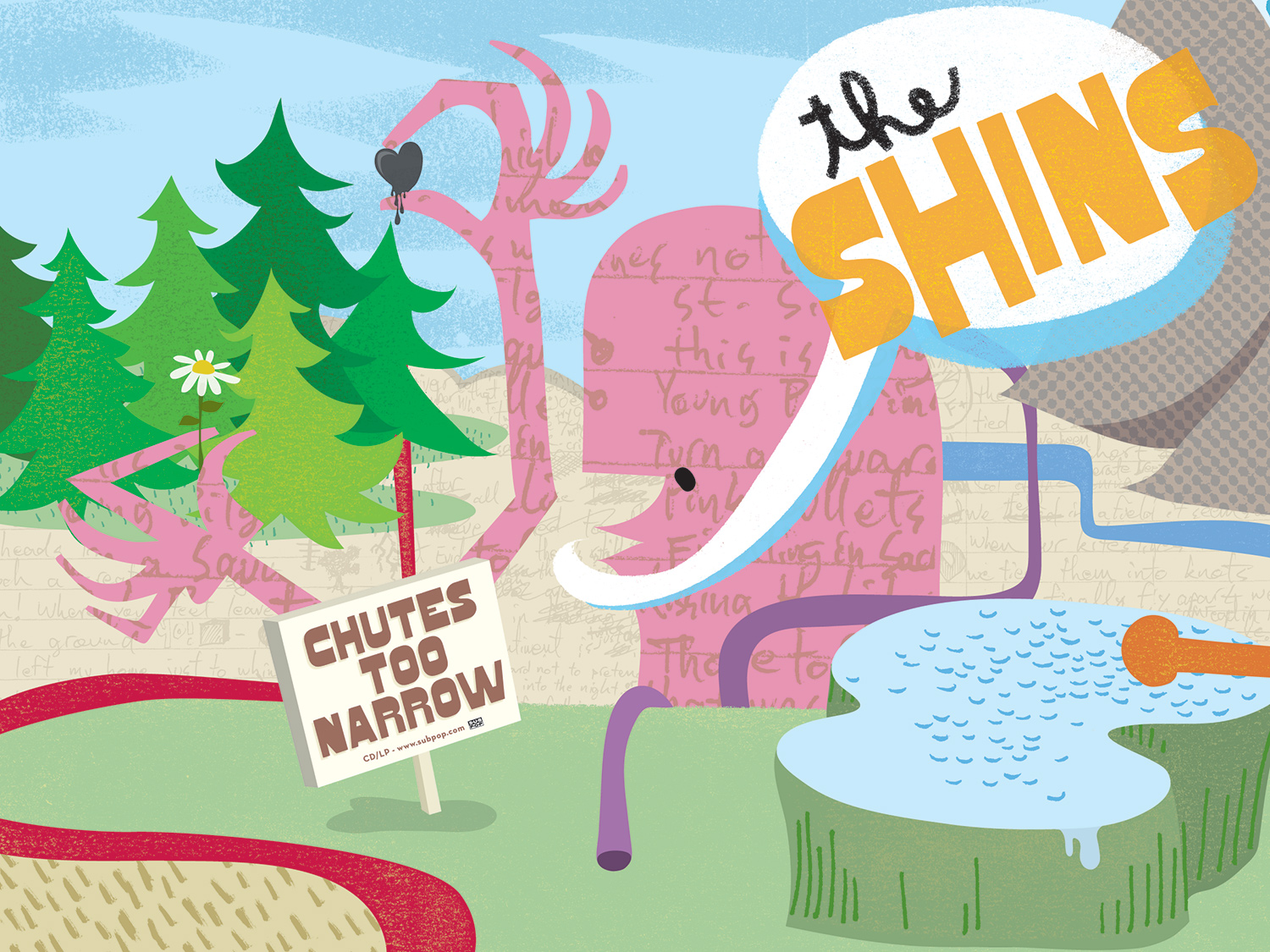
THE SHINS
Chutes Too Narrow album packaging
The Shins’ sidestepped the dreaded “sophomore slump” on their second album through maintaining a consistent musical vision—one filled with witty, idiosyncratic pop music. To match that, the artwork is playful and boundless. The CD contains a die-cut booklet, enabling the viewer to see and feel dimensionality when the booklet is folded. The LP has a gatefold jacket with white vinyl.
The various elements within the CD/LP design was able to spin off into a robust advertising campaign, POP sales displays, promotional materials, and merchandise.
2005 Grammy nominee for Best Art Direction


