Bad Client serigraph
(scroll to the bottom to order)
I’ve been incredibly fortunate in my career. Nearly every client I’ve worked with in my 20+ years of doing this has been a genuine pleasure to work with.
However, I worked with someone who just broke my lucky streak. This print is dedicated to her.
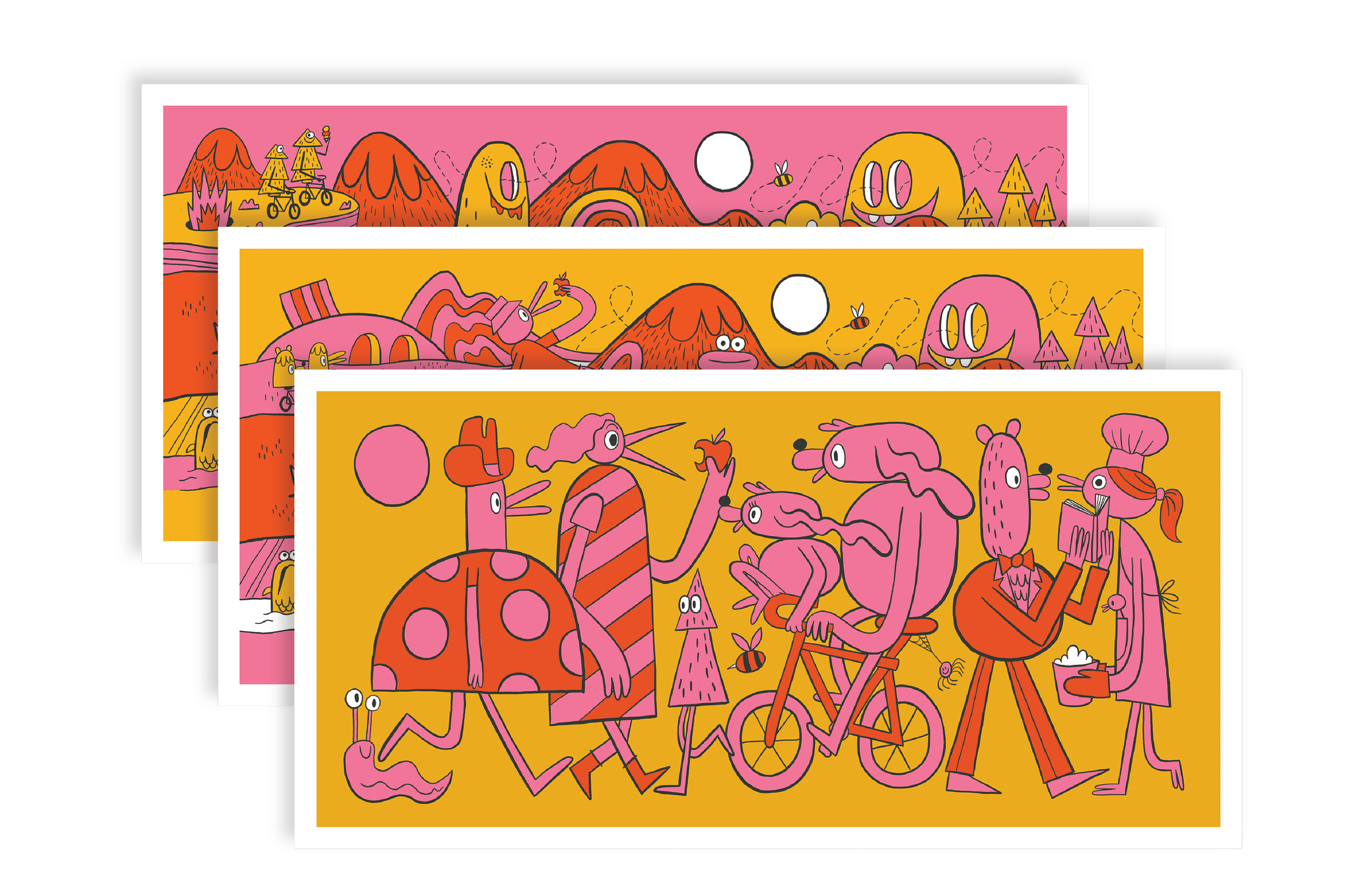
The prints are available in 3 options: Individual prints, a set of all three, and a very limited uncut sheet of all three. Scroll to the bottom to order.
It all started okay!
A woman was opening a food truck and wanted to commission me to create art for her new truck. She liked the design I did for our mutual friend’s company. She was just starting out and was a friend of a friend so I gave her a significant “buddy-of-a-buddy-with-a-small-business” discount. She said she hadn’t worked with an artist before, so I did a significant amount of hand-holding through the process…giving her some free consulting work on her branding and further suggestions on how to save some money. We agreed on a flat fee of $XXXX so there would be no surprises at the end. Charging a flat fee vs hourly is almost ALWAYS a better deal for my clients. If I want to toil away on something, nobody but myself is nobody is paying the price for those hours lost on dead-end ideas.
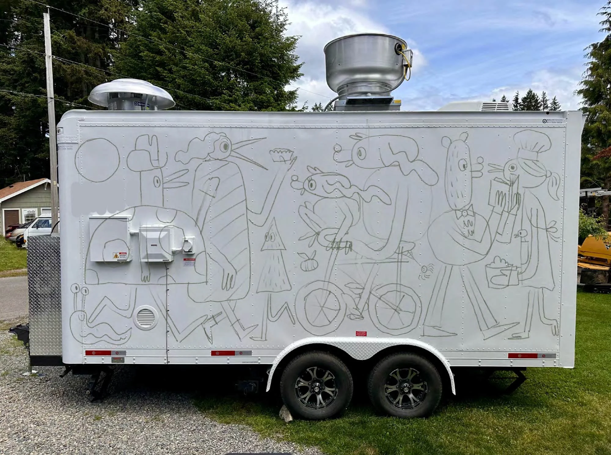
Round 1: Community! Diversity!
My first sketch was something I felt encapsulated our telephone conversation. It was inclusionary, referenced her origins as well as a nod to the Pacific Northwest.
Her Feedback:
Hello Jesse,
The weekend has been great so far. I’m in bend Oregon at the moment! Hope you’re enjoying the nicer weather too.
Thank you for sharing the initial sketch! It’s fun! The slug and bugs are cute. The tree character is great. I like the [REDACTED] being in the mural! I like how there’s a kind of movement in it. Thank you for the description of your thought process.
I have to admit I was hoping for something a bit edgier. It’s a bit wholesome and I would be keen for something a bit more ambiguous/kooky/weirdoish. I really apologise as I didn’t voice it more clearly. I haven’t worked with an artist before so my newbie-ness prolly hindered the process. I know time is important and I definitely want to keep it as streamlined as possible.
I like this past work you’ve done. I should have sent it to you to show the style I was hoping for. I really like the AC Newman poster. l like the mountainous mossy creatures. I like the funny/derpy smiles. The textural lumps and bumps. How there’s larger lumps and smaller lumps. The cloud creature. Perhaps mountains eating [REDACTED]? Perhaps a mountain creature riding bikes? I like the bike friends and tree silhouette. I think something like the textural movement of the AC Newman work would be really great. It’s quirky and fun. Since the trailer is so blindingly white, the texture might help give it a bit of depth?
I guess that’s what I meant when I said abstract, the mural being ambiguous and not so straight forward. I know my instagram isn’t very helpful in terms of setting the tone I want I depict either. I’m sorry I didn’t put it into words properly during our conversation.
Thank you for your time and patience!
Bad Client

The AC Newman poster Bad Client referenced
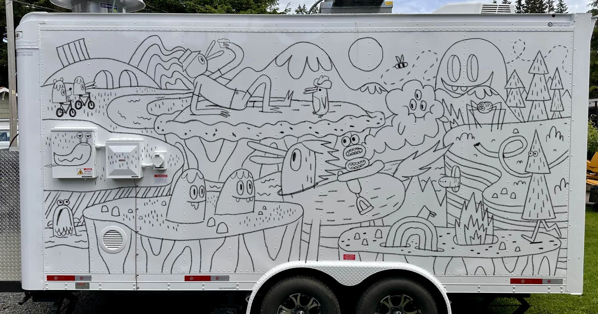
Round 2: Okay! You want weird? I like weird!
And mentioning the 16 year old poster is also a helpful reference to understand what she’s looking for. While I wasn’t super jazzed about starting completely from scratch again, a project isn’t a success unless the client is thrilled. My next sketch leaned heavily on the vibe of the AC Newman poster, while integrating elements that resonated from the first round.
Her Feedback:
Hi Jesse,
The sketch is fun and it’s closer to what I was hoping for! Thank you again for taking the time to give it a go!
I like the movement in the illustration. I really like the right side with the trees and the perspective, it’s more layered and the depth is nice. I love the tree with eyes. I love the insects, the three eyed spider is great, the slug and the fish on the left has a great funny facial expression. The bee is cute too. I like the little worm popping out the side of the land! The rainbow with the fez is fun too along with the burning hole!
I think a move away from animal characters might be where my mind is. I like the little lumps with the derpy teeth. Maybe that could be in place of the bear and the duck bike riders? Or tree friends riding bikes might be fun if not lumps. Lumps, do they eat [REDACTED]? Trees, do they eat [REDACTED]? I dunno, a move away from I guess “realistic” animals replaced by fictional creatures instead would be great. I like the lumps, the tree creature, and the insects.
The mountains in the back are nice, more of the mountains with added texture please? I think more forest/trees would be nice too. I’m leaning to moist green forest vibes. More moss please! Sort of a kind of “dampness”? Maybe less “summery”?
I think the little “islands” have what looks like sort of eucalyptus trunk texture? I like the tree trunk texture. The [REDACTED] is a good move.
When I look at the AC Newman illustration, I think what did it for me was the load of textural elements to it. The layers to it. The more 3d perspective. The lumps had fuzzy/melty texture to it and I like that. The cloud and its textural face. I do like how you added a three eyed cloud in the illustration for the [BRAND NAME] wagon. I like how there was a hand popping out of the side of the island/land in the Newman illustration. Maybe a hand popping out, holding a [REDACTED] if to move away from animal characters?
I think [REDACTED] might be considered a bit wholesome. I dont mind if we move away from that a bit? I like the sorta kooky and weird stuff.
I appreciate you taking the time to work with me. Thank you for your patience and understanding. I know it took you time to think of ideas for the illustration and it’s not easy. It’s definitely in the right direction and I think it’s getting really close!!!!
Thank you so much,
Bad Client
Round 3: On the right track!
I refined, based on her feedback and sent her round 3.
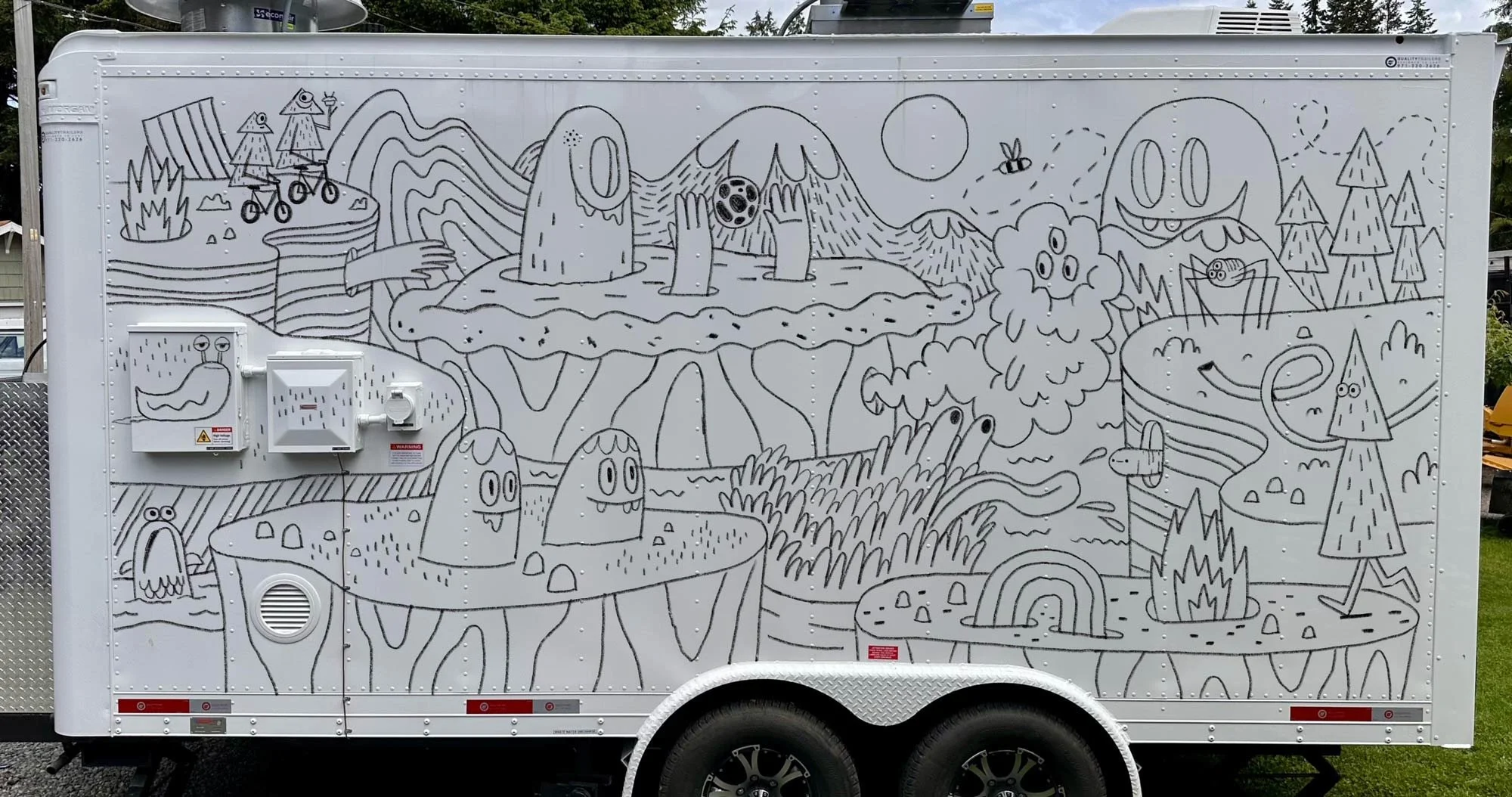
Her Feedback:
Hi Jesse,
Thanks for working on the sketch! The sketch is great! It’s definitely more what I was hoping for!!
The only notes I have are I’m not sure what the creature popping out of the [GROUND] has between his hands. By the head of the [REDACTED] creature, the mountain scape might look a bit like a fin? Perhaps if the mountain is extended it might help? The upper left corner by the bike trees, would more trees or mountain scape be nice there vs the curve?
It’s fun and a bit kooky. Really love it!
Thank you,
Bad Client
Round 4: We’re close, right?
I made the few recommended tweaks and sent the 4th round, thinking we had landed it.
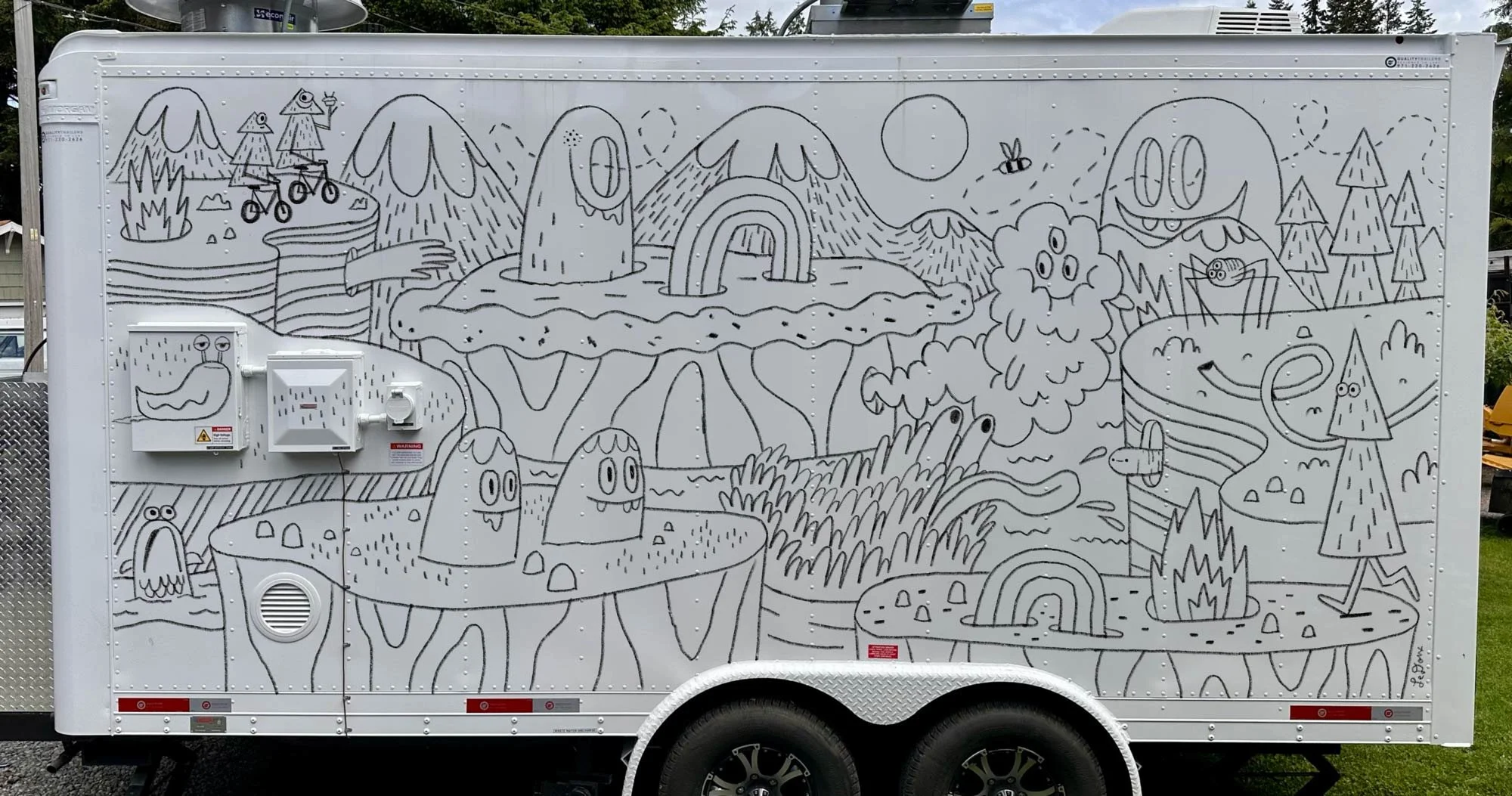
Her Feedback:
Hi Jesse,
I’m sorry for the belated reply. Thank you for the update!
I’ve been super slammed with work. In the midst of it I have been giving the mural a lot of thought, and I think it may not be direction I want to go in. I really do apologise as I know you’ve worked hard on it and this isn’t the ideal outcome! With the added cost of the painting it on, I have many [REDACTED] to sell to make it happen and it’ll take a while. Please let me know how you’d like to proceed.
Thank you,
Bad Client
I responded with:
Hi Bad Client.
Good to hear that the [REDACTED] are flying!
I’ve read your email through several times and am having a hard time understanding your intention. Are you hoping for more time to think about the current version? Or are you saying that you want to kill the project?
If you’d prefer to kill the project, I can invoice you for what is called a “kill fee”. It’s half of the total amount (so $XXXX). Like you said, it’s not the ideal outcome for either of us—me having done 90% of the work and only being paid for half of it, and you paying a lot of money with nothing to show for it. But it happens, and it’s better for you to make the call now, rather than coming to this decision after the work is complete.
Let me know if you do indeed want to kill the project, and I can get an invoice over to you.
Thanks Bad Client,
Jesse.
And Then Her FINAL Response:
Hi Jesse,
What is your hourly rate and how many hours did you spend on the project?
Although I did say I haven’t worked with an artist, I did go to art school and am aware of how a brief works and the level of effort involved.
I’m not going to use the artwork because of all the people I showed it to, no one liked it, and it never got to the point it needed to be.
It makes me uncomfortable to pay $XXXX for work that not a single person liked as an overall consensus. That’s a months wage for me at [DAY JOB].
Bad Client
In Conclusion:
One guiding principle that I’ve carried throughout my career is that nothing should leave my desk unless I’m happy with it. It’s a given that the client needs to be happy. But if I’m not happy with it too, I feel I didn’t try hard enough. With this series of prints, I’m putting that into practice by doubling down on it. Not only am I happy with it, but I’m hoping there’s 100 people out there that also enjoy it enough to own it as a print.
And to all you artists/designers out there trying your hardest to make a living off your art:
It doesn’t matter how small or how friend-of-a-friend a potential client is, get an agreement in writing. I was a dummy, believing in the good of humankind. Protect yourself.
Signed/numbered edition (80 individual, 10 uncut, +10 AP)
Sized at a convenient 21.75 x 11 to fit in IKEA RÖDALM frames.
Screen printed by Broken Press.
Bad Client uncut sheet
Bad Client set
Bad Client round 1
Bad Client round 2
Bad Client round 4